
Heart icon update

The problem
For years users have expressed confusion on the icon that is used to save an asset to a collection. We also know that users that:
Users with 2 or more Collections convert at a rate of around 30%
Users with 0 Collections convert at a rate of around 10%
Fun fact - When Airbnb switched their Wish List icon from a star to heart, engagement increased by 30%.
So we know what the problem is and the potential outcome so let’s solve this!

This was the “save to collection” icon used by Shutterstock for years.

Placement of the save icon inside an image detail page.

Here you can see the icon in context under the image.

This is an older version of the same area, the word lightbox was eventually changed to collection but you see the + inside the circle had a long history in Shutterstock.
My role
UX director steering strategy, overseeing designers, and helping support the idea in product discussions.
My contributions to this project really stemmed from my director position in that I influenced the research initiation, helped gain buy-in from product leadership, and continued to speak to strategy during implementation.
Major kudos to the designers who helped me and others get this project off the ground, Matthew Gottesman and Marie Bocquet. Also shout out to product owners Noshin Nisa and Chris Constentio for helping FINALLY get this idea into production.
Research
Research goal
Gather an initial read on user perceptions of various "Save to collection" icons to determine if changing the icon would aid in recognition
Narrow down icon options (if changing icon would be beneficial).
Key questions:
How do stock customers perceive the existing "Save" icon?
How do stock customers perceive alternate "Save" icons?
What do stock customer expect will happen when they click on the "Save" icon?
Method
4 sets of tests with 10 participants each
Each set focused on one contextual icon option
All sets included a qualitative ranking of all 4 icon options
All icon labels removed to test icon information scent *
40 English-speaking, stock image customers, selected by Usertesting.com (UT).
CURRENT icon (+ in a circle) user impressions
When viewed contextually, users generally understood that it meant "adding" but felt it was ambiguous.
When compared to other icon options, users overwhelmingly felt it least represented "saving an image".

How do users perceive other icon options?
When compared non-contextually, users have equal recognition of the three other icon options.
However, the folder icon is the most polarizing of the three.
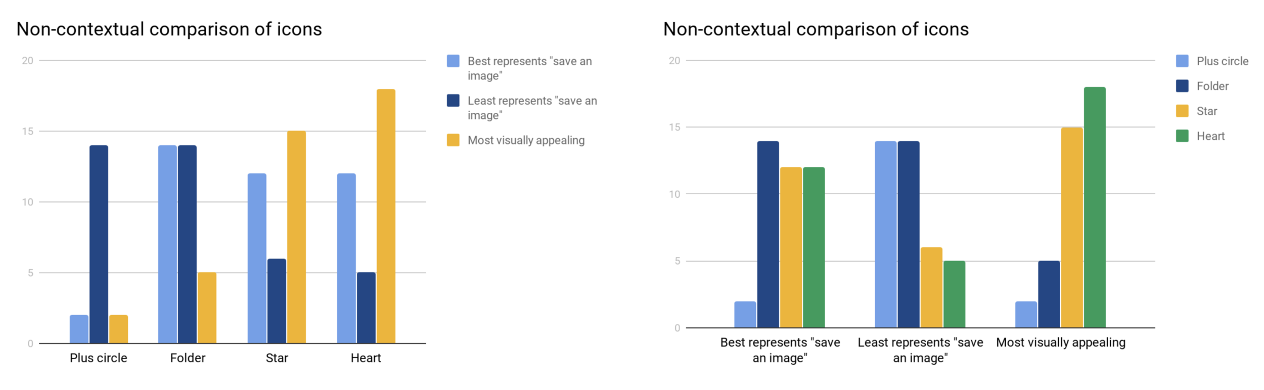
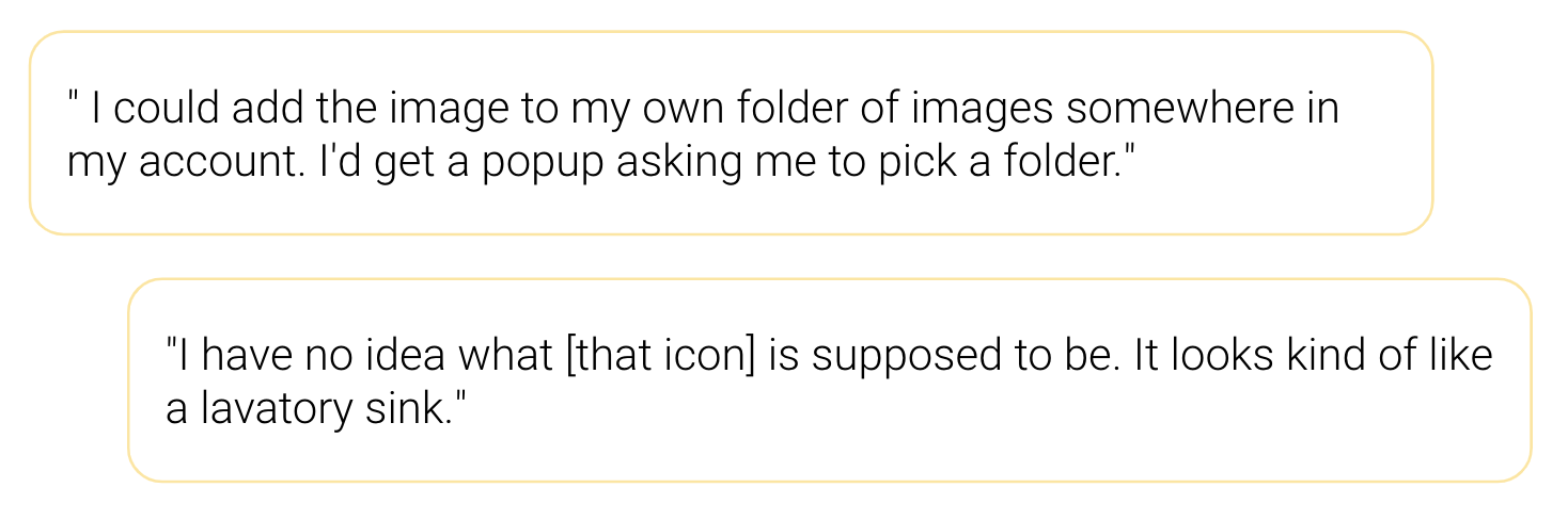
What was the reaction to the folder icon?
The folder icon has the most accurate information scent of all the icons when viewed contextually and the most uneven recognition when viewed non-contextually.
What was the reaction to the star and heart icons?
The star and heart have the most recognizable, easy-to-understand general meaning but less understanding of the specific saving mechanism.
Users understood that both icons would save the image somewhere but viewed it more as a toggle action rather than requiring specific selection of where to store it.


What happened next
Very clear that an icon change should be tested but we had been sitting on this idea for almost a year.
With frustration around a “fear of shipping” looming over us we worked together with product to push the idea of the heart though with out testing in that we knew it would be successful.
Goal
Increase engagement with “save to collection” feature
Increase overall conversion
The solution
Arguing for the heart: Looking at the research results and the options there the heart icon was the winner in our minds. Understanding that the heart and the star had the highest recognition and visual appeal to get users to click through even if the actual saving mechanism is more specific than expected. With this we also looked at the user feedback saying that the star felt as if it was more of a ranking where as the heart is more of a save type function. We also didn’t have to look far to see other apps using the same pattern so let’s not try to reinvent the wheel here either.
After-all (as mentioned above) When Airbnb switched their Wish List icon from a star to heart, engagement increased by 30%.
Why not the folder: The folder had the most ambiguity to users and carried a perceived complexity of action which adds friction. Therefore we felt comfortable abandoning that option.
On web
The biggest challenge with changing the icon on the website is an overall hesitation of change for fear it would effect revenue. So I, some UX team members, and a small product team fought to have it put in as we felt strongly that it would be successful. Finally after several weeks [and a leadership change] product leadership green lighted the project and we were full steam ahead.
On native
Native was a bit easier to gain buy in in that we just could update the icon and experiment there with out any major risk as the app is more of an engagement tool thank a revenue tool.

Launch
This project has had many phases to the launch:
February 2020 - Changed all icons to a heart (hover states, asset detail page, etc).
March 2020 - native apps updated icons to hearts
April 2020 - web launched “persist heart” on search results page wherein the heart is always visible drawing attention to that feature.
May 2020 - native apps to launch “persist heart” feature


Results
Changing the icon to a heart
On web (Feb 2020) - The data at this time is a bit inconclusive and further skewed by the downtick in traffic. due to Covid so not reliable.
On native (March 2020) -
iOS - Increased ⬆46% over the last 2 weeks compared to the previous month’s 2 weeks.
Android - Increased ⬆113% over the last 2 weeks compared to the previous month’s 2 weeks.
Changing the heart icon on iOS increased engagement by 46%.

Changing the heart icon on Android increased engagement by 113%.
Persistent hearts on Search results pages
On web (April 2020) - Early numbers are ⬆25% increase in engagement and ⬆15% increase in conversion.
On native (May 2020) - Numbers will be available in mid to late May.
Whats next?
We realize that there may be user behaviors that are associated with a heart icon as the word associated with the icon is often “favorites” and this could influence the heuristic of how users perceive the action. We will further evaluate the action of saving in order to see if we can further improve our KPIs on this idea.