


1
2
3
4
5
6
7
8
9
Introduction
H2Observer connects users to water data that can help them make insights on their property or infrastructure.
The tool measures 2 main factors RISK and COLLECTION
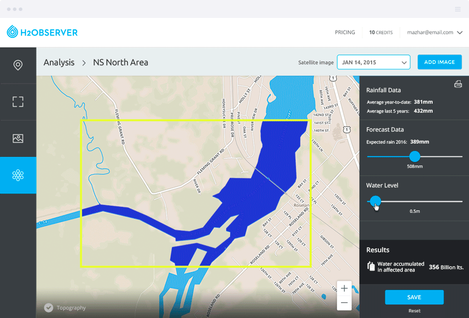
Risk - Know the water-related risk and threat to your high-value infrastructure. Your high value assets (oil wells, mobile towers, golf courses, highways, landscapes, etc.) are under threat when it comes to water damage. Whether it’s flooding of a nearby river, an incoming storm, or water accumulation due to an above average rainfall, H2Observer’s Risk Assessment application gives you a consolidated view of all water-related threats arising that pose a risk to your high value assets.
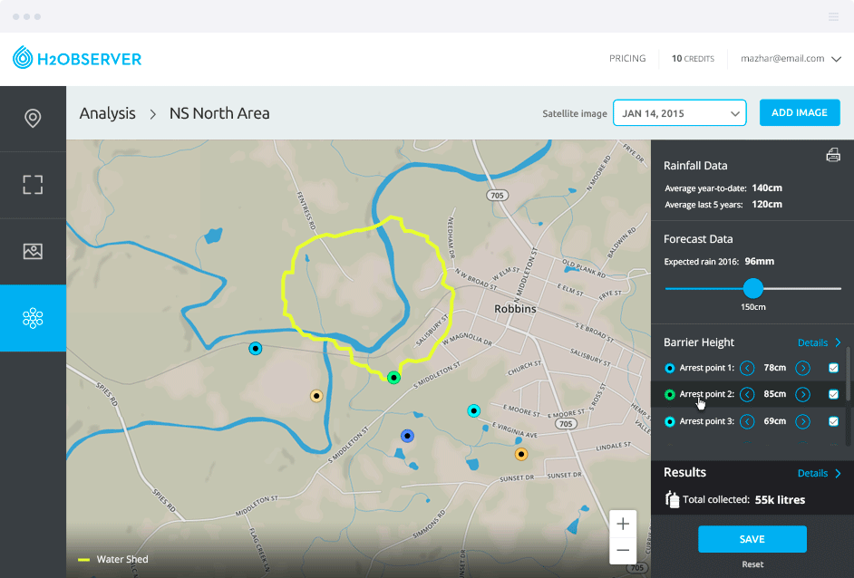
Collection - Know the best areas to collect water and perform a ‘what-if’ analysis to get the optimized solutions. Water collection can be extremely complex; physical features such as topography, terrain, weather, rain, and soil water retention all need to be considered while deciding where and how much water is safe to store. H2Observer’s Water Collection application empowers you to make the right decision by not only considering the above-mentioned concerns, but because it provides the ability to change the observer parameters and check how they might affect the overall water collection in various ‘what-if’ scenarios.
Background
I worked as product owner, creative director, and strategist on this project. I worked on the UX fully at the beginning of this project before working in tandem with one of our UXUI designers on the Webonise team. H2Oberver was built in response to another project we were working on that had access to data rich GIS data. This allowed us to build a tool that could allow users to not only look at historical satellite imagery but also assess the flood risk and collection of water opportunities on property of interest.
Challenges
There wasn't any tools we found out there that were doing anything like this so we tried to keep the requirements small to start so that we could start to build out the tool in a way that would feel easy to users. Once you are in the map visualization area you'll notice that we placed all controls on the right, away from navigation and on its own to clearly define the areas distinct purpose. We did look closely at how Digital Globe was displaying historical satellite images and took some inspiration on the check box and slider usage for the time line.
Proposed Solution
The solution here marries the ease of a simple tool with the dense data that one needs when assessing land and water. The tool visually feels light and intuitive all while delivering insight you cant get from any other tool.
Recommendations
We went back and forth in wire-framing on the best area to put controls and worked hard to make the right panel the only place to enter or manuiplate input to influence the map area. We had them along the bottom at one point but realized the eye lines were very jumpy, going top to bottom, then left to right, then top to bottom again on the right side of the page. Therefore having the nav top to bottom on the left and the controls top to bottom on the right made the most sense visually and I think worked well here.
More Information
You can sign up for beta access at http://h2observer.com/