
Heart icon updates for Shutterstock

Let’s set some context…
The Product Design team at Shutterstock had tried to suggest for years that our icon for “saving” assets to a collection was all wrong. Unfortunately they were not able to convince the Product team that this would be a measurable impact and thus shut down the idea.
…And that is where I came in.
Empathize and Define

The Problem
For years users have expressed confusion on the icon that is used to save an asset to a collection (essentially when you find an image you like you can save it to an album and name it type action). We also know that users that:
Users with 2 or more Collections convert at a rate of around 30%
Users with 0 Collections convert at a rate of around 10%
We had the added challenge of convincing the project team that this project was “worth” the effort. They had shut down this idea several times so we knew having convincing research was key in winning them over this time.
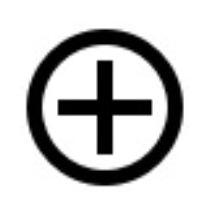
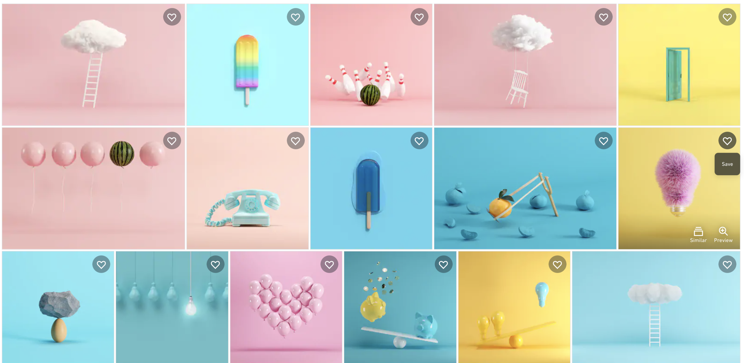
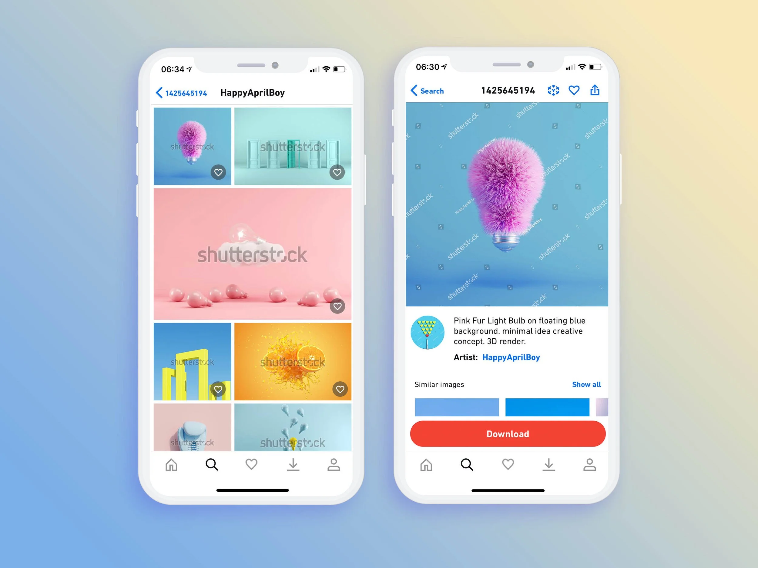
This was the “save to collection” icon used by Shutterstock for years.
Placement of the save icon inside an image detail page.

Here you can see the icon in context under the image.
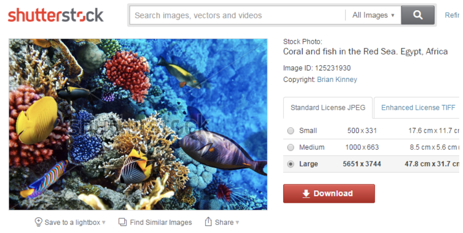
This is an older version of the same area, the word lightbox was eventually changed to collection but you see the + inside the circle had a long history in Shutterstock.
Fun fact - When Airbnb switched their Wish List icon from a star to heart, engagement increased by 30%.
So we know what the problem is and the potential outcome so let’s solve this!
My Role and the team
My Role: Director Product Design
My contributions to this project really stemmed from my director position in that I influenced the research initiation, helped gain buy-in from product leadership, and continued to speak to strategy during implementation.
The team: The project was cross company in nature so eventually involved all teams from core e-commerce, to enterprise, to mobile apps. Biggest shout out to product owners Noshin Nisa and Chris Constentio for helping FINALLY get this idea into production.
Product Design and Research - Erin Essex, Matthew Gottesman, and Marie Bocquet
Business Goals
1. Increase engagement with “save to collection” feature
2. Increase overall conversion
User Goals
1. Users should be able to find the “save” function extremely quickly
Team Goals
1. Show that the product design team has ideas that can impact the bottom line.
Goals
Ideate / Prototype / Test

Research Goal
Gather an initial read on user perceptions of various "Save to collection" icons to determine if changing the icon would aid in recognition. Then narrow down icon options (if changing icon would be beneficial).
Key questions:
How do stock customers perceive the existing "Save" icon?
How do stock customers perceive alternate "Save" icons?
What do stock customer expect will happen when they click on the "Save" icon?
Method
4 sets of tests with 10 participants each
Each set focused on one contextual icon option
All sets included a qualitative ranking of all 4 icon options
All icon labels removed to test icon information scent *
40 English-speaking, stock image customers, selected by Usertesting.com (UT).
Research goals and Method
User Perceptions

The 4 variants we tested.
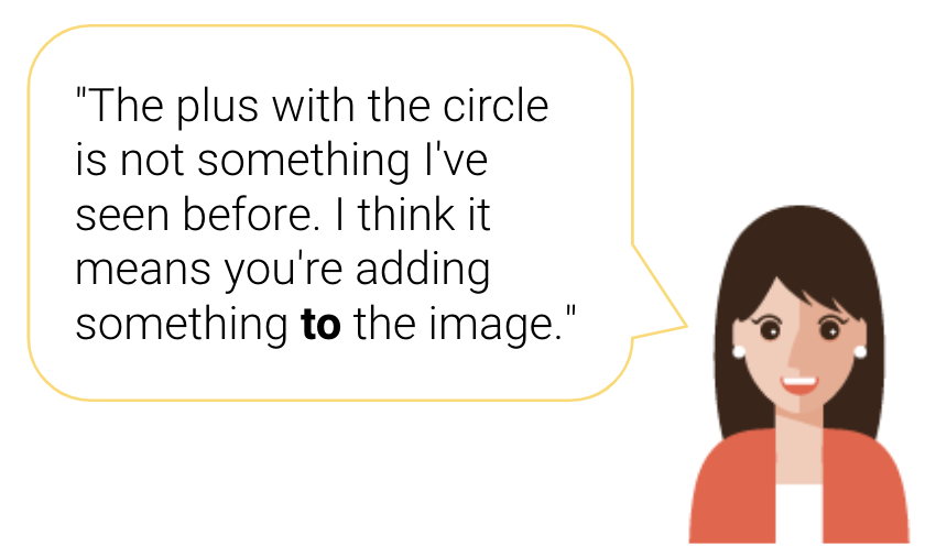
CURRENT icon (+ in a circle) user impressions
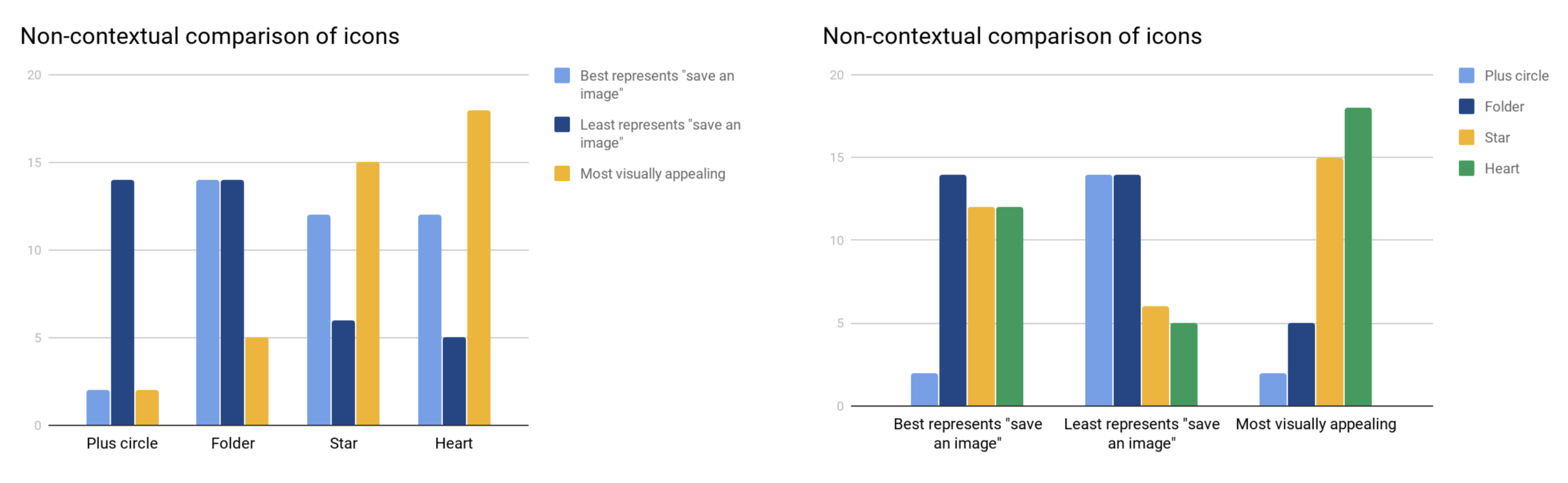
When viewed contextually, users generally understood that it meant "adding" but felt it was ambiguous. When compared to other icon options, users overwhelmingly felt it least represented "saving an image".
How do users perceive other icon options?
When compared non-contextually, users have equal recognition of the three other icon options. However, the folder icon is the most polarizing of the three.
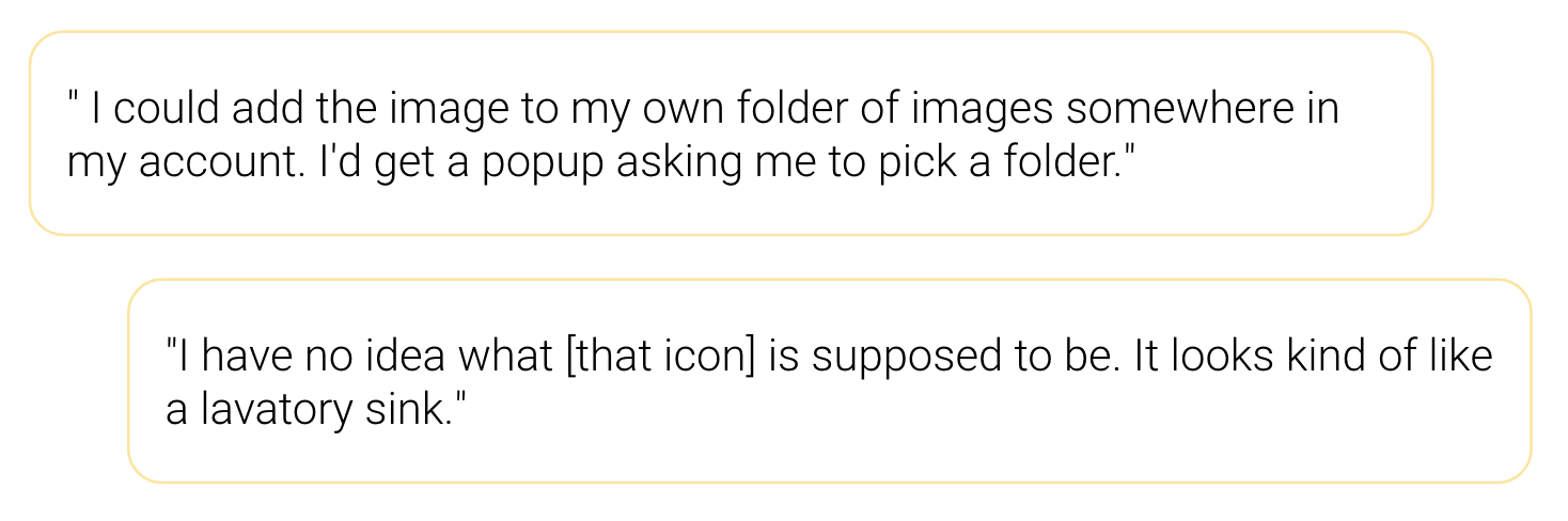
What was the reaction to the folder icon?
The folder icon has the most accurate information scent of all the icons when viewed contextually and the most uneven recognition when viewed non-contextually.
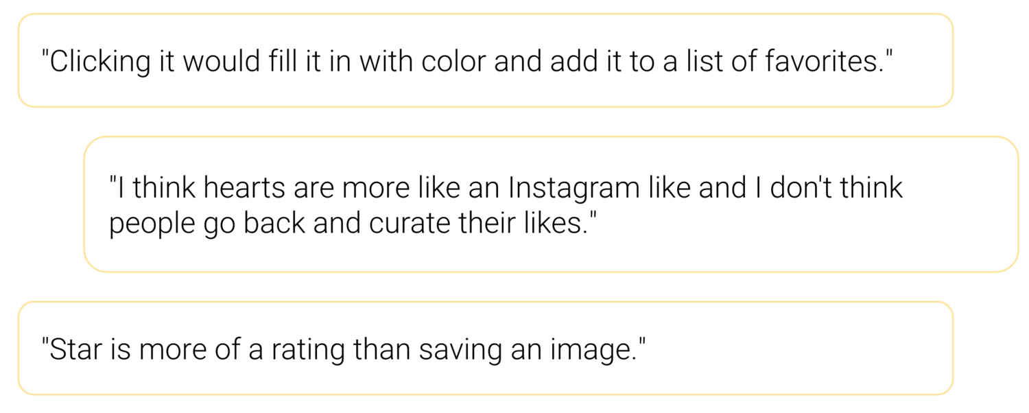
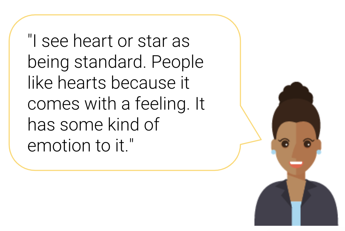
What was the reaction to the star and heart icons?
The star and heart have the most recognizable, easy-to-understand general meaning but less understanding of the specific saving mechanism.
Users understood that both icons would save the image somewhere but viewed it more as a toggle action rather than requiring specific selection of where to store it.
Location Test
Now that we had narrowed down WHAT the icon should be, we wanted to also test if the current location was the most optimal for the icon.
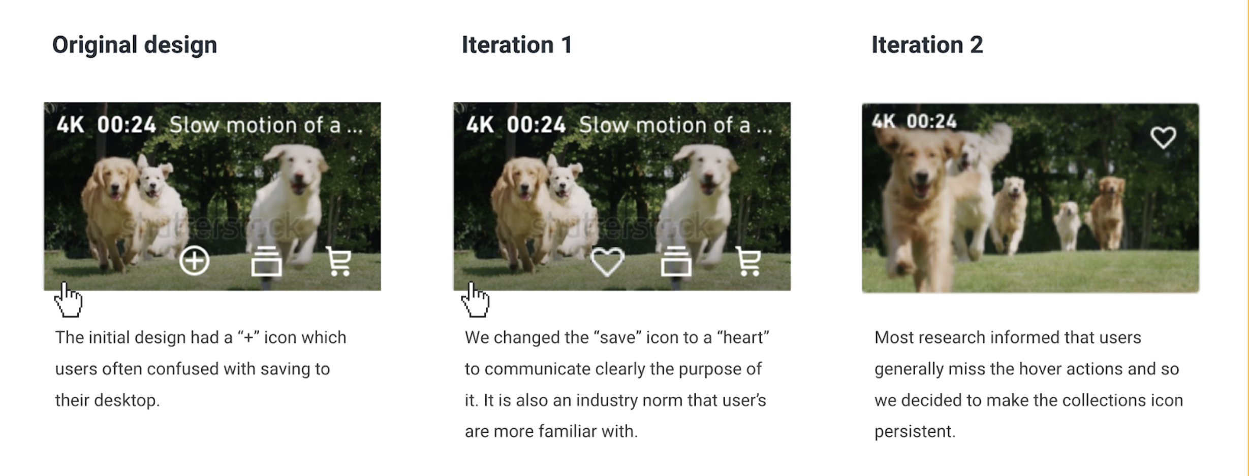
Ultimately it was clear that having the save action behind a hover state was hindering its discoverability so we decided to pitch in addition to the icon change that it also is static on the page with out the need for a hover state.
REAL TALK: One might ask: “But Erin, now your test has 2 changes - the icon itself and the location, doesn’t this make for a test where we don’t know which one of these changes had the most impact?”
Yes, 100% - If we could have choose we would have suggested that these 2 things be launched independently, one after the other. However the nature of the company at the time was such that the likelihood that we would launch both changes in a reasonable time frame was very slim. If we didn’t launch both at the same time we risked that one of them might sit on the back burner for a year or more. So we had to strike while the iron was hot. You will see in the results section there is about a month gap between the 2 changes launching.
Findings: Icon
Arguing for the heart: Looking at the research results and the options there the heart icon was the winner in our minds. Understanding that the heart and the star had the highest recognition and visual appeal to get users to click through even if the actual saving mechanism is more specific than expected. With this we also looked at the user feedback saying that the star felt as if it was more of a ranking where as the heart is more of a save type function. We also didn’t have to look far to see other apps using the same pattern so let’s not try to reinvent the wheel here either.
After-all (as mentioned above) When Airbnb switched their Wish List icon from a star to heart, engagement increased by 30%.
Why not the folder: The folder had the most ambiguity to users and carried a perceived complexity of action which adds friction. Therefore we felt comfortable abandoning that option.
The heart was the clear winner.
Findings: Location
Our tests clearly showed that having the icon on the screen and not dependent on a hover state was the best way to present this action to users.
Fears
It was very clear that an icon change should be tested live on the site due to the findings however the product team remained fearful about any changes to the site. There was even a phrase the team used for this - “fear of shipping.” It should be noted that this was in part due to the fact that we didn’t have a reliable A/B testing solution at the time.
So we decided to be very tactical with the product team in developing a roll out plan that would help them gain the confidence that the icon update would be a positive change.
Ultimately what we pitched and went with was to roll out the new icon in a smaller test market (Canada). Finally after several weeks [and a leadership change] product leadership green lighted the project and we were full steam ahead.
Findings and fears
Below is a screenshot of what the icon ultimately looked like on our asset detail page.
Solution
Launch and Measure

This project has had many phases to the launch:
February 2020 - Changed all icons to a heart (hover states, asset detail page, etc).
March 2020 - native apps updated icons to hearts
April 2020 - web launched “persist heart” on search results page wherein the heart is always visible drawing attention to that feature.
May 2020 - native apps to launch “persist heart” feature
Launch
Measure
Changing the icon to a heart
On web (Feb 2020) - The data at this time is a bit inconclusive and further skewed by the downtick in traffic due to Covid so not reliable.
On native (March 2020) -
iOS - Increased ⬆46% over the last 2 weeks compared to the previous month’s 2 weeks.
Android - Increased ⬆113% over the last 2 weeks compared to the previous month’s 2 weeks.
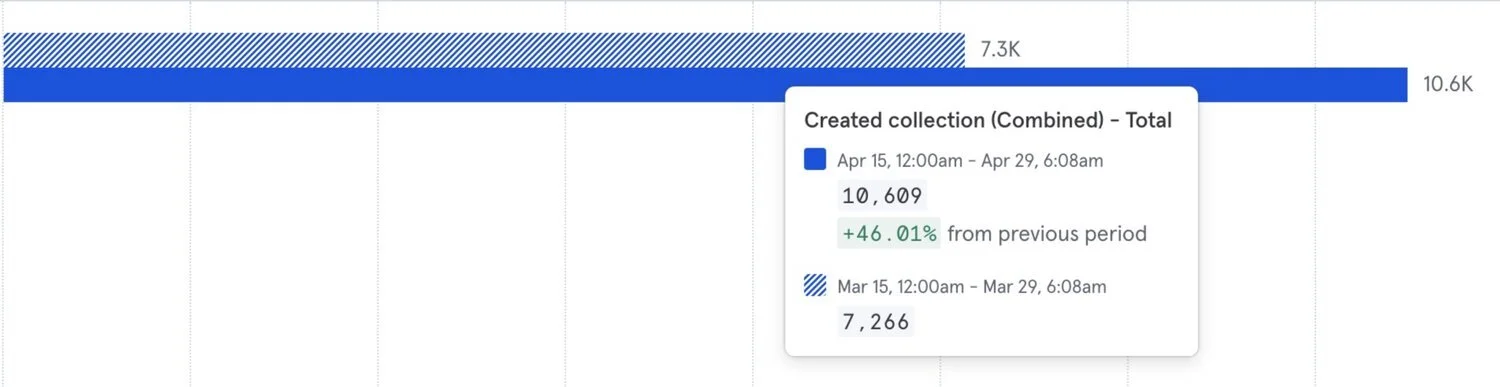
Changing the heart icon on iOS increased engagement by 46%.
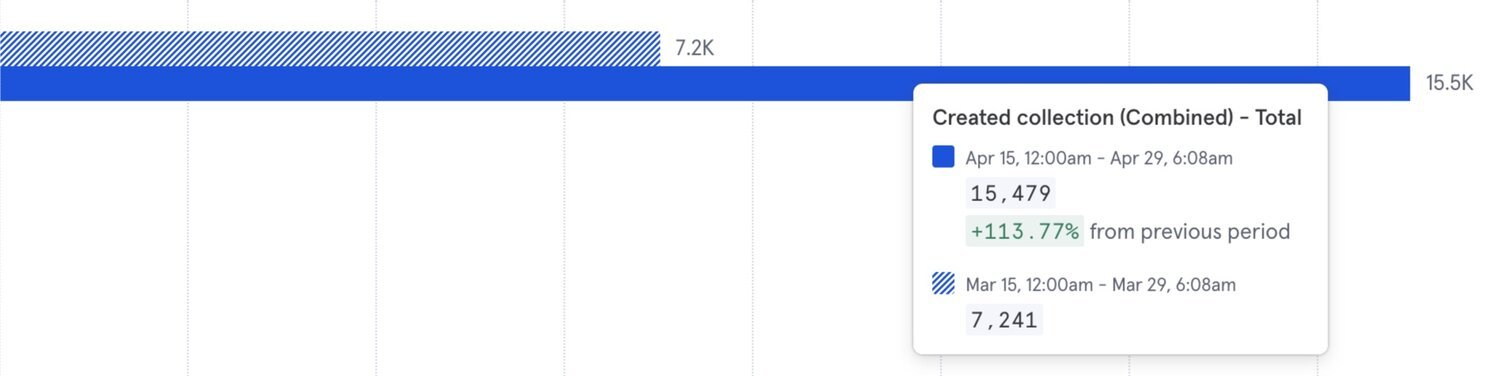
Changing the heart icon on Android increased engagement by 113%.
Persistent hearts (heart static on page)
We launched the experience as a test to Canada (April 3rd) and America (April 18th ) through Launch Darkly and compared the number to the previous time period. Following are the improvements we have observed.
Launch to Canada 🇨🇦
Data points are from April 3rd to May 3rd.Number of clicks on Collections icon: ↑26.2%
Total number of collections users: ↑9.7%
Number of new collections created: ↑17.3%
Launch to USA 🇺🇸
Data points are from April 18th to May 2nd.Number of clicks on Collections icon: ↑24.3%
Total number of collections users: ↑22%
Number of new collections created: ↑11.6%

Funnel on the Shutterstock website.
On web - Early numbers are ⬆17.8% increase in engagement and ⬆14.5% increase in conversion.
On native - Sadly I was not able to get this data before exiting the company.
Reflection
Was the project successful?
I’d say so! We proved our hypothesis and ultimately the company sold more images, music, and videos because we fought for this change. Was it a lot to fight for, yes, but so worth it.
How to better communicate ideas to leadership and compromise.
What did I learn?
I love sharing this project because people are often shocked at how much we had to do to prove that this icon update would work. Honestly thinking back it was a lot, but it was needed with the overall hesitancy for change in the company at the time.
Stick your neck out - If data supports you don't be scared to pitch your idea, even if it feels risky professionally.
Trust your gut (with data)- When the idea isn't popular with leadership look at the data and research support an idea build the case for it and pitch the idea as polished as possible.
Lead by example - Being a mentor and leading by example for the other people on this “tiger team” was impactful for them. It showed them how they could approach problem solving, communication, and presentations.